I am an ecommerce professional who loves wearing Zara but have little or no patience to stand in long queues in its stores during weekends. Naturally I was looking forward to Zara going online for a hassle free shopping experience from the comfort of my home sweet home. Here’s my two cents worth on how they can improve their customer experience
UI/UX– The image sizes are too big on the product landing page which makes it very browsing heavy. When one clicks on the product categories on the left navigation they land on a product page with less than 2 images per page.
Schema/Left Navigation Menu– Leaf category drop down menu on the left navigation is too small and requires more than a perfect 6/6 to make out the listed sub categories. Also the navigation becomes easier if it is hoverable and not clickable
- Although it is mentioned at the bottom left corner that one can select multiple options but since the font size is very small the user might overlook the text and assume the filters are radio buttons and not check boxes
- Certain key filters such as material are missing for sub categories such as Bags. While the product material is mentioned in the description however there is no option to select the material before hand
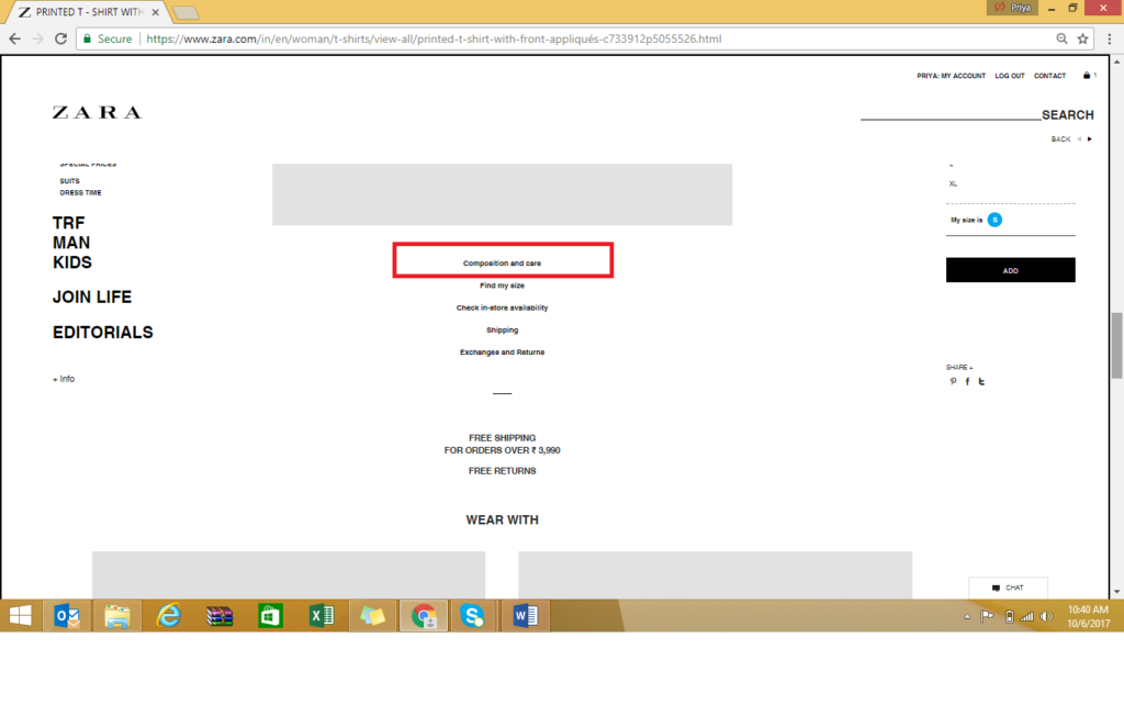
- Filters such as fabric is missing for tshirts,dresses etc. You have to scroll down on the product page to see composition of the fabric which again makes it very browsing heavy
Search- Though searching the key words redirects us to the right set of products however the filter option disappears from the top navigation and one has to click on a product to filter out the size options
Category Landing Pages– Some of the category landing pages can be better utilized by showcasing adequate big sales. For eg when I click on MAN I land on a page showcasing a video of their curated products and to go on the product page I have to click on the left navigation again. This would lead certainly to drop outs lowering down the conversion rates.
Sort From– Sort by filter on the top right corner helps in improving discoverability of products and navigation becomes easier. There could be various options such as sort by new arrivals, Price low to high
Font Sizes– Font sizes have to be increased. One has to really focus to read most of the content both on home page and product display page.
Overall for an ardent Zara fan like me who had been waiting for an online option to splurge on, I was left feeling a bit disappointed. I hope they pick on customer / user feedback and improve upon the online experience in near future updates.
About the Author
Priya Paliwal
She is a marketing professional and an Ecommerce gal on a desk by the day. She believes planet (and consumers) can be saved by offering delightful services everywhere.


I hate zara website for the lack of all the features mentioned above, they seem to have a standard website everywhere, I use it in the UK.. hope they change it and make life easier coz seriously who wants to stand in queues and they have the worst staff ever..they seem to be rude universally from my experience and what I have heard from others. Zara better start listening to their consumers